Most fans of Farer agree on one point: bold color, high detail, and transcending micro-brand boundaries a serious design languageIn this interview, we spoke with the Farer team about everything from the origin of the brand name and their production approach along the London-Switzerland route to the behind-the-scenes design decisions, from GMTs to the Aqua Compressor.
1) Noun "Farer"
Question: The name “Farer” comes from concepts like explorer, wayfarer, and seafarer. What does this represent in the brand's DNA? How did this name and the idea of exploration influence your design decisions when designing your first collection?
Reply: The name "Farer" actually comes from an abbreviation of "farewfarer" and "wayfarer," meaning to travel or explore. Our first two hours were GMT, which was very fitting for the travel theme.
2) “British design, Swiss made"
Question: Yourself British design, Swiss made That's how you define it. How do you balance that in practice? How does the creative process work between the design desk in London and the production side in Switzerland?
Reply: We strongly reflect our British DNA in the design: the color combinations, finishes, style, aesthetics, and details that make the watch stand out. Then we combine this with the best Swiss qualities possible at our price point: always top-grade movements, A-class case workmanship, double Super-LumiNova, applied indices, etc… The result is a visually striking watch, backed by reliable quality and performance.
3) Bold use of color
Question: For many collectors, Farer means bold color and strong contrast. Where does this fearless color approach come from? How do you decide on such distinctive palettes instead of classic tones that are more commercially safe?
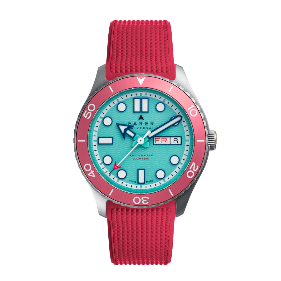
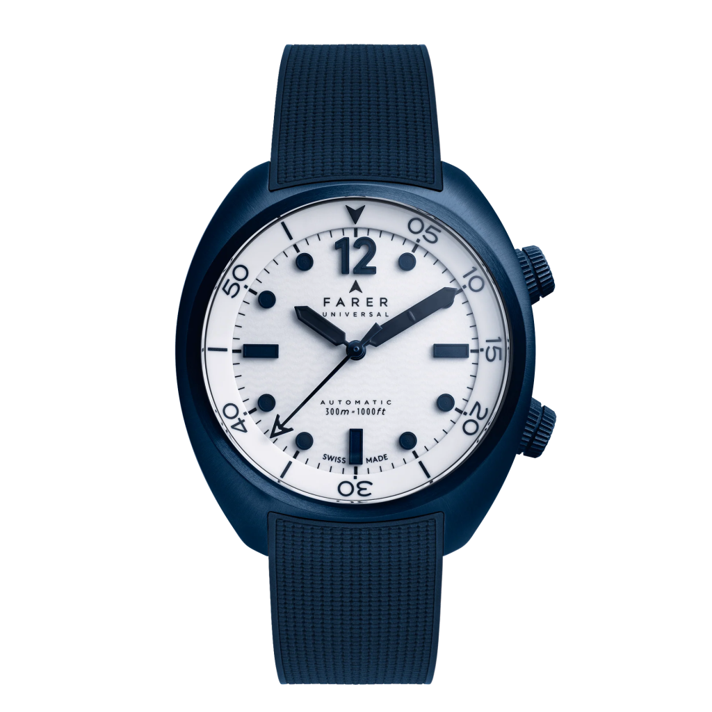
Reply: If you asked me what my two favorite non-watch brands were... Paul Smith or Missoni That's my concern. Neither of them are huge brands, but they have a clear reputation when it comes to color. We adopt a similar approach in watches. Even in our simpler designs… For example, the Resolute III is a watch with a white dial: it has double numerals in blue lume, and black paint is applied over them, thus creating a unique look. halo A (light ring) effect is created. Then you pair this with straps in colors like Avocado, Petrol, Teal, Orange, Burgundy, Marine, Green… So even in more subdued designs, the color is always very prominent.
4) GMT: a true travel companion.
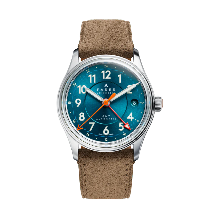
Question: GMT and travel are at the heart of Farer. What do you think transforms a modern GMT watch from simply a time zone display into a true travel companion? What real-world use cases were you considering when designing the Farer GMT series?
Reply: Basically, you're either traveling or you have to work in two time zones. I think that's very common these days. For pilots, however, World Timer, if used skillfully enough, allows them to track three separate time zones: takeoff, landing, and home.
5) Aqua Compressor: Preserving the classic, modernizing it.
Question: The Aqua Compressor collection offers a modern take on classic supercompressor diving watches. Today, revisiting this 1960s technical solution with a titanium case and La Joux-Perret movement, which elements were essential to retain, and which did you want to completely modernize?
Reply: Aqua Compressor is actually extremely comfortable; because turtle shell It has a (tortoise shell) profile and very short lugs. This allows even a relatively large watch to be comfortably worn on small wrists. The double crown and inner bezel are key elements of the watch. Thanks to titanium, we were able to reduce the weight by almost a third. The LJP movement also offers the user a 68-hour power reserve; this makes it a very versatile tool/adventure/dive watch. With PVD coating, we will be able to express color on the case and crown in the future. The Ocean Blue version has become very popular.
6) Transition from microbrand perception to mature independent brand
Question: Looking back from your first quartz models in 2015 to today, Farer... microbrand What was the turning point that transformed it from a perception-driven brand into a more mature, independent one? Among the GMTs, chronographs, Aqua Compressors, and hand-wound pieces, which do you think was the real game changer?
Reply: I think the release of the automatic chronograph and the subsequent introduction of the World Timer shortly afterward was a turning point. That was around the end of 2019/beginning of 2020.
The cushion case series, released in 2021, was primarily well-received in the everyday dress watch segment; it became popular and expanded our audience.
7) How is a new Farer model born?
Question: How does the process begin when a new Farer model is born? Is it with a theme (an explorer, a place, a record) or a technical idea (new case shape, new mechanism, new dimensions)? Can you take Bersenti readers behind the scenes, from the first sketch to the final wrist-worn product?
Reply: Sometimes it starts with a single object; sometimes with a complication we want to create; and sometimes with an idea for a case shape… For example, a 35mm cushion case…
Generally, we develop case and bracelet options before finalizing the mechanism and therefore what kind of watch it will be.
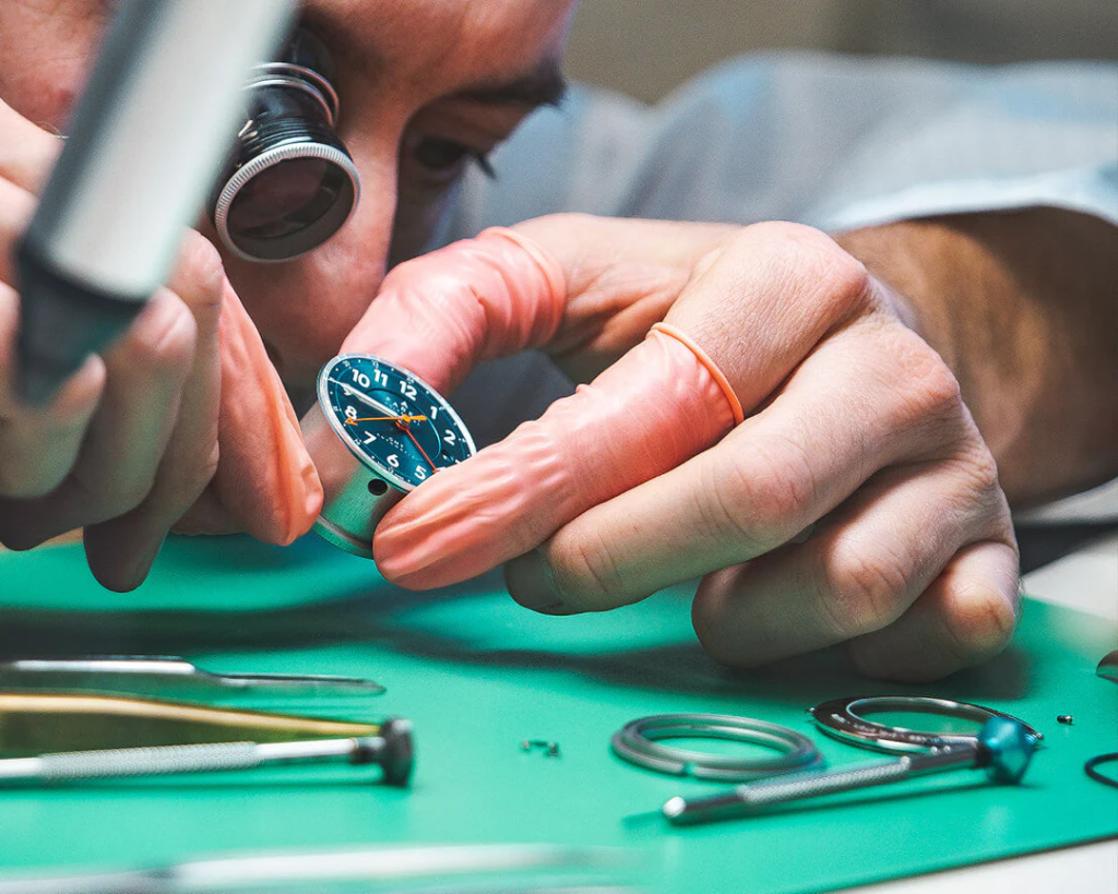
I start with hand drawings; then Philippe Cogili from the internal team and I develop the cases; then Mike Heath, also from internally, moves on to the dials. The process is a constant back-and-forth. And honestly, half the ideas end up in the cutting room: some are eliminated during the rendering stage, some during 3D printing, and some even get rejected in the first prototype…
8) High value at an affordable price.
Question: Farer, High value at an affordable price. It is praised for its performance. What are the principles you never compromise on while maintaining this balance? For example, what are your red lines inside the company in areas such as mechanism selection (Sellita, La Joux-Perret), finish level, or belt quality?
Reply: We like using better mechanisms, three-dimensional dials, and A-grade finishes; A-grade is especially important to us on polished surfaces. Individual screws to secure the case back, box-shaped sapphire crystal… these are essential. If there is a date disc, we always use a date disc that matches the dial color, etc.
9) Shrinking cases and the neo-vintage trend
Question: In recent years, we've seen two major trends: smaller case sizes and a strong neo-vintage aesthetic. How does Farer interpret these trends? How do you plan to evolve your collections in terms of size, thickness, and overall design language in the coming years?
Reply: We've always been on the smaller side of things; now we're adding our smallest yet, the 35mm cushion. But obviously, designs tend to become more conservative on the larger watch side; so in 2026 we're adding a 42mm watch so we can offer a wider range. The 30s, 40s, 50s, 60s, 70s, and 80s; they all have elements that can be incorporated into the design.
I think mixed media is going to grow significantly: for example, combining a Mother of Pearl dial with an aluminum chapter ring, or pairing a guilloché dial with Italian marble sub-dials…
10) A message to young collectors
Question: Finally, what would you say to young collectors who are following from afar but don't yet own a Farer? Which lifestyle model would you recommend for someone buying their first Farer? Why?
Reply: Start with a field watch or a three-hand model; once you get used to it, move on to complications: GMT, World Timer, Chronograph, etc.
The word "Universal" is on every dial; meaning we believe our appeal lies in its broad scope. But of course, it appeals more to the user who wants 3D detail, unique color combinations, and a high-quality mechanism/complication.
We are seeing young watch enthusiasts, such as those aged 16-18, in our growing customer base; this is very pleasing.
Horology is a wonderful hobby: it's relatively accessible, democratic, small-scale, and has a very good community you can be a part of if you wish.